The Art of Combining Burgundy and Blue
A burgundy and blue wedding colour palette offers an elegant and distinctive approach to wedding design in 2027. Combining the richness of burgundy with the freshness of blue, this sophisticated pairing creates a beautiful balance between romance and contemporary style.
From soft powder blue and deep wine-red florals to bold cobalt accents and refined tablescapes, burgundy and blue wedding ideas can be adapted to a variety of celebrations. Whether set in a historic Italian villa, a vineyard estate in Tuscany or an elegant venue in Piedmont, this colour combination brings personality and depth to every detail.
The key is finding the right balance between shades, textures and the surrounding setting, allowing the palette to feel cohesive without becoming overly coordinated.

Credits: Anna
Blue in Wedding Design: From Powder Blue to Cobalt
Blue is associated with calmness, elegance, and freshness. Its wide range of shades makes it particularly versatile in wedding design, allowing couples to create anything from a delicate, airy aesthetic to a more dramatic look.
Powder blue and French blue bring softness to the celebration. They can be introduced through flowing fabrics, bridesmaid dresses, table linens, and stationery. Cobalt and royal blue, on the other hand, offer greater intensity and can make a stronger statement through textiles, decorative details, or selected design elements.
Blue also pairs naturally with neutral shades such as ivory and soft green. When combined with burgundy, however, it takes on a more distinctive character, balancing the richness of the deeper red with a cooler tone. This contrast makes the combination particularly interesting for couples seeking something less conventional.

Credits: Pinterest
Burgundy: Rich Tones and Romantic Details
Burgundy is a deep red colour with subtle purple undertones, inspired by the rich wines of Burgundy, a renowned wine-producing region in France. Depending on the shade, it can range from dark wine red and oxblood to softer berry tones, making it suitable for both dramatic and understated wedding designs.
Flowers are a natural way to introduce burgundy. Roses and dahlias in deep red shades can add dimension to floral arrangements, especially when combined with ivory blooms, soft greenery, and seasonal flowers. The colour can also appear in candles, napkins, ribbons, and stationery, bringing depth to the design without overwhelming it.
Paired with powder blue, burgundy feels softer and more romantic. Combined with cobalt, it creates a stronger contrast with a contemporary edge. In both cases, the balance between the two shades allows the palette to feel distinctive while retaining its elegance.

Credits: Wezoree
Creating a Balanced Wedding Reception
The reception is an opportunity to bring the palette to life through colour, texture, and lighting. The proportions used will determine whether the final look feels light and understated or rich and dramatic.
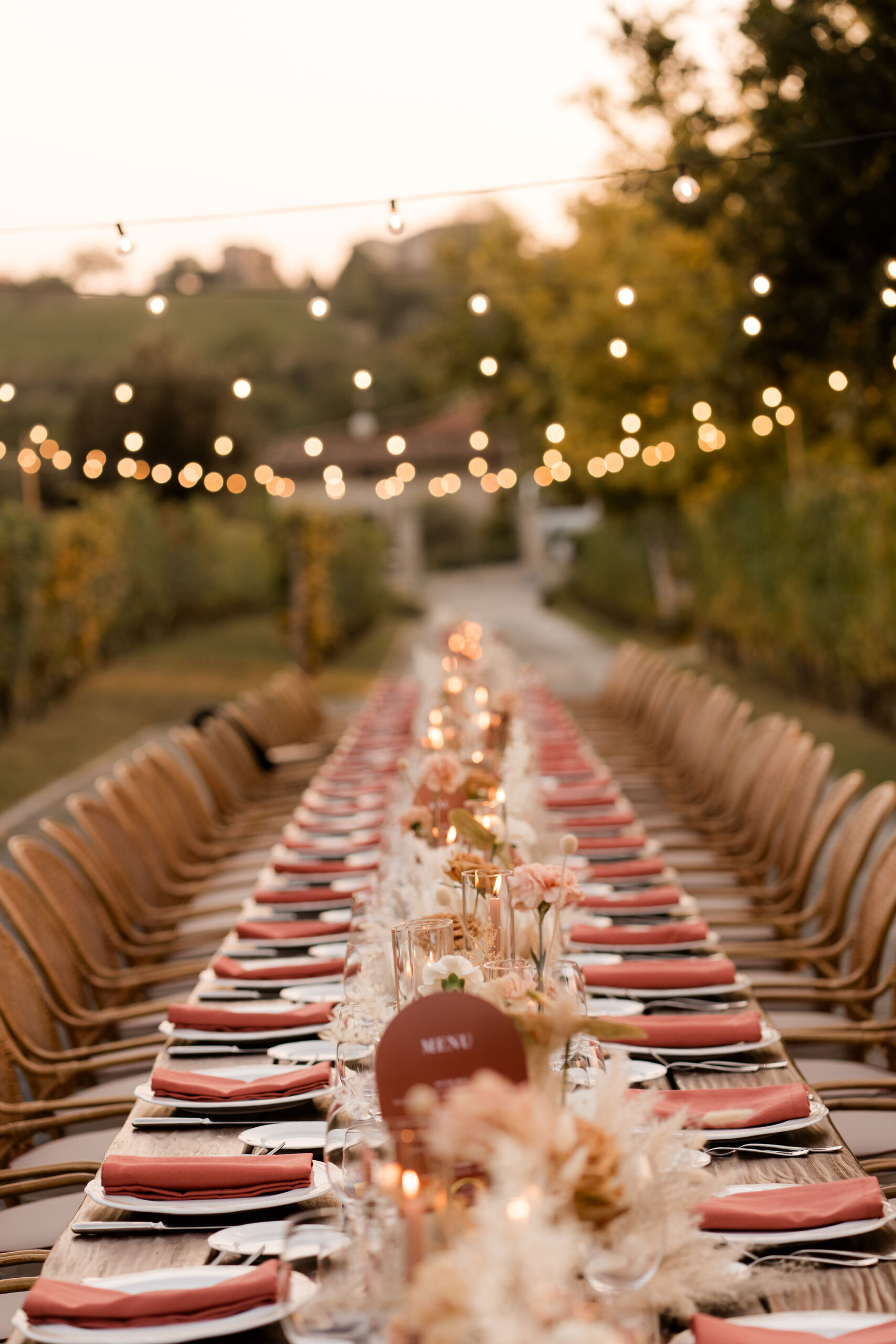
For a softer interpretation, powder blue linens can be paired with burgundy floral arrangements, ivory candles, and delicate glassware. Neutral tableware keeps the setting balanced, allowing the colours to stand out without competing for attention.
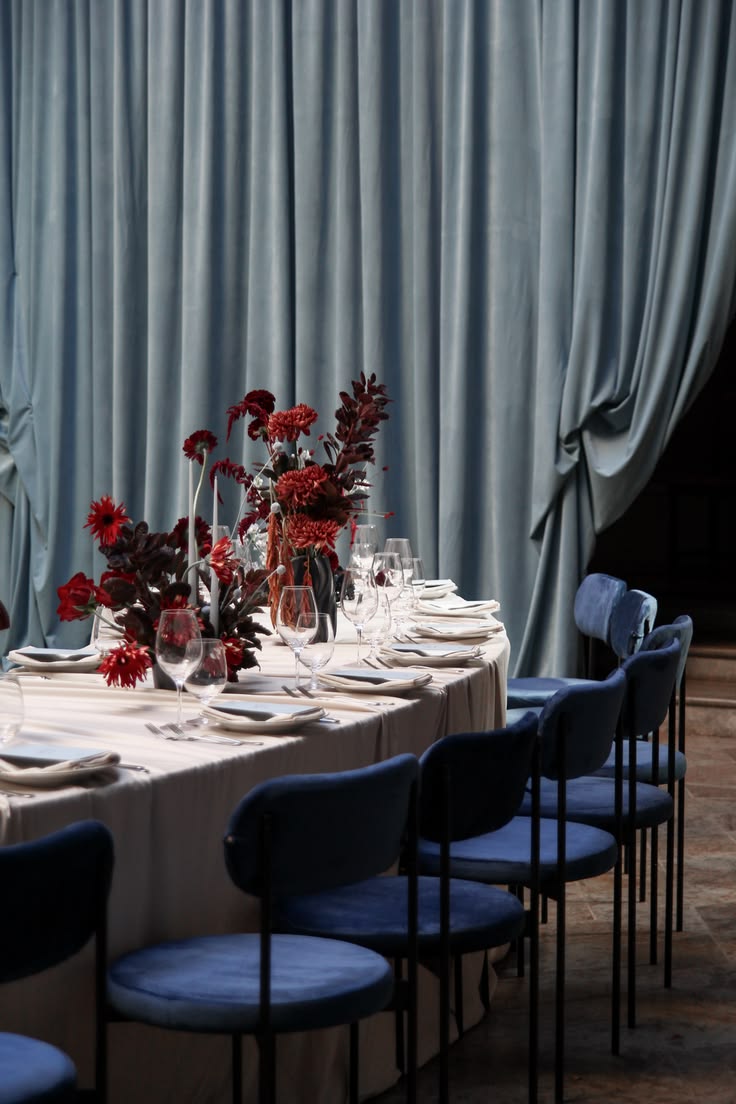
For a more dramatic approach, deeper blue fabrics can be combined with burgundy flowers, warm metallic accents, and layered candlelight. Draping can introduce movement and frame specific areas, such as the ceremony backdrop or reception space, while adding another layer of texture.
The goal is not to repeat the same colours across every element, but to create a visual connection between the different parts of the celebration. Varying the shades and materials helps the design feel natural rather than overly coordinated.

Credits: Котон Бутон cтудия декора
Florals, Stationery and Finishing Touches
Smaller details can make the palette feel complete. In floral design, burgundy blooms can be balanced with ivory flowers and greenery, while blue can appear in ribbons, decorative vessels, or other carefully selected accents. The availability of naturally blue flowers will depend on the season and the desired shade, so textiles and accessories offer additional flexibility.
Stationery provides another opportunity to introduce the colours before the wedding day. Burgundy typography on pale blue paper creates a softer contrast, while blue details on cream invitations offer a more understated interpretation. Menus, place cards, and ribbons can then carry these tones through to the reception.
Texture is just as important as colour. Linen, silk, textured paper, and glass each interact with light differently, adding interest without the need for additional shades. These finishing touches help connect the design while leaving room for variation.

Credits: Herlia Paper
Adapting the Palette to Italian Wedding Venues
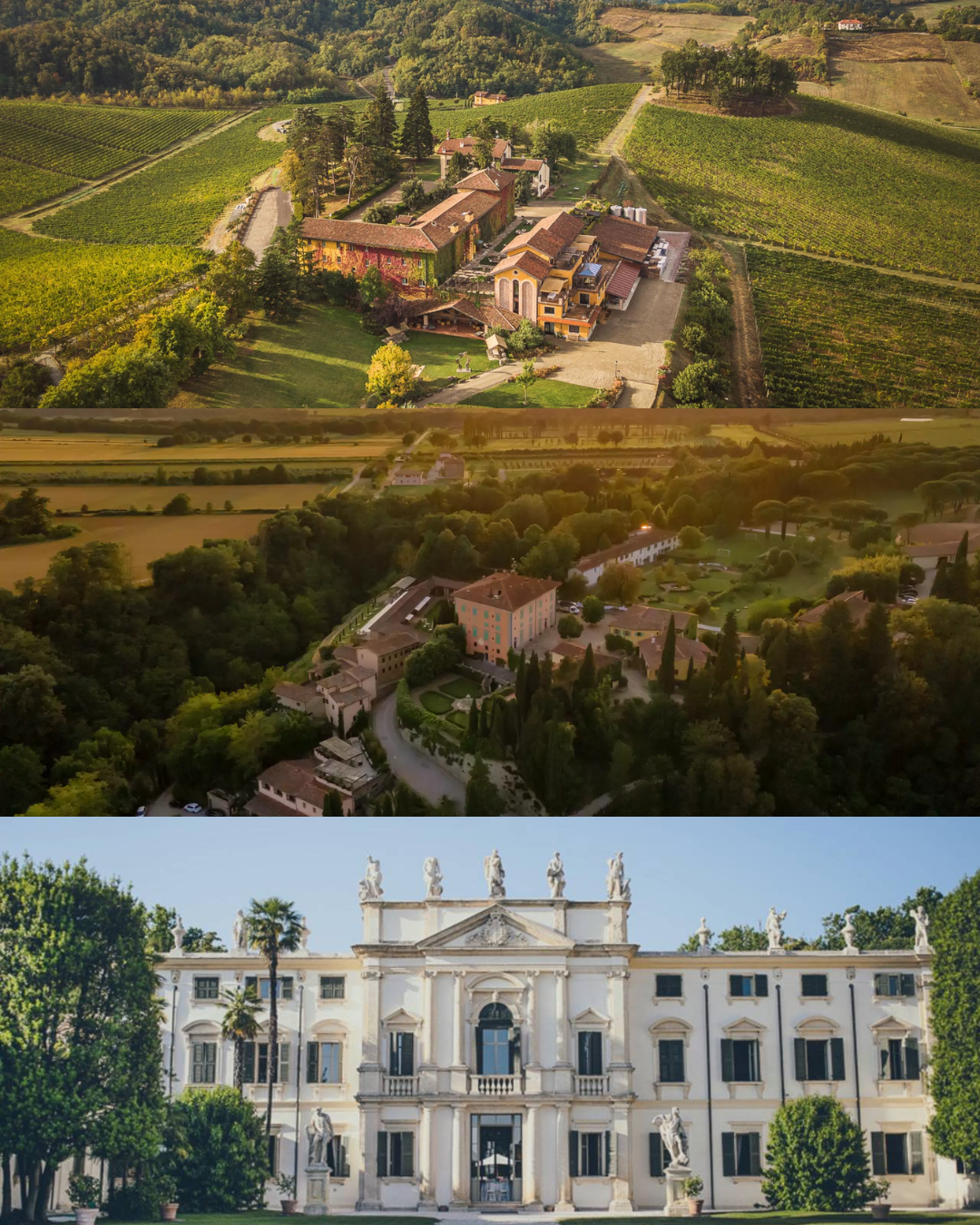
The versatility of burgundy and blue makes them suitable for a variety of Italian settings, from vineyard estates to historic residences.
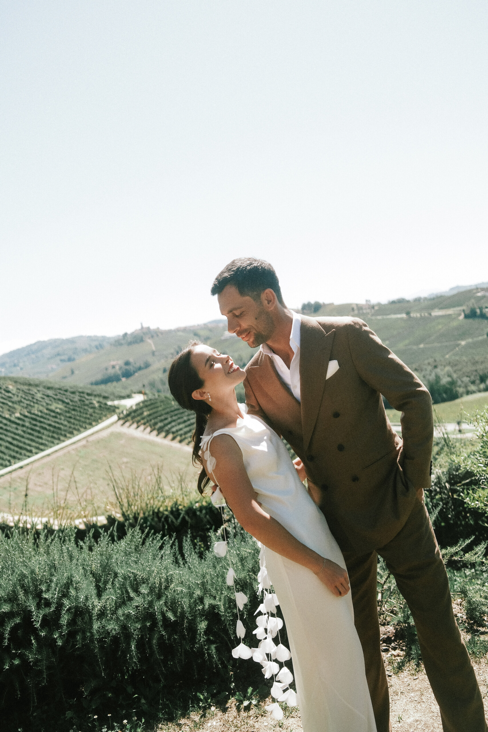
For a vineyard wedding in Piedmont or Tuscany, powder blue, burgundy florals, and natural linen can complement the surrounding greenery and rolling hills. The softer tones keep the design connected to the landscape, while the deeper red introduces contrast.
In a historic villa or Venetian palazzo, richer shades of blue and burgundy can highlight architectural details and elegant interiors. Antique finishes, refined tableware, and candlelight enhance the depth of the palette, creating a more formal atmosphere.
Seasonality can also influence the final combination. Lighter blues and berry tones lend themselves to spring and summer celebrations, while deeper shades of both colours suit the atmosphere of autumn and winter weddings.
Ultimately, the most successful palette is one that responds to the venue and reflects the couple’s vision. Burgundy and blue offer plenty of room for interpretation, allowing each celebration to develop its own character through thoughtful choices in colour, texture, and design.
Planning a Burgundy and Blue Wedding in Italy
A thoughtfully designed wedding begins with a colour palette that reflects the couple’s personality while complementing the venue and its surroundings. Burgundy and blue offer endless possibilities, from romantic countryside celebrations to sophisticated receptions in historic Italian villas.
At VIARISIO we create bespoke destination weddings across Italy, combining thoughtful planning with a personalised approach to wedding design. Contact us to create a celebration that feels harmonious, elegant and truly individual.